
In part 1, we built a basic custom schedule layout that shows events from multiple days. In part two, we’ll add few more features to improve this layout:
- Day headers
- Hour labels
- Background lines separating each day and hour
Day Headers 
Currently, you can scroll the layout to view events across multiple days, but we don’t actually show what date it is anywhere.
We’ll start with a basic day header composable to show the date along with a preview:
@Composable
fun BasicDayHeader(
day: LocalDate,
modifier: Modifier = Modifier,
) {
Text(
text = day.format(DayFormatter),
textAlign = TextAlign.Center,
modifier = modifier
.fillMaxWidth()
.padding(4.dp)
)
}
@Preview(showBackground = true)
@Composable
fun BasicDayHeaderPreview() {
WeekScheduleTheme {
BasicDayHeader(day = LocalDate.now())
}
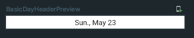
}Here’s our simple header for a day:
Now, let’s create another composable that will show the headers for each of the days across the top. We can use the built in Row composable and wrap each item in a Box with a modifier to set the width to our day width.
@Composable
fun ScheduleHeader(
    minDate: LocalDate,
    maxDate: LocalDate,
    dayWidth: Dp,
    modifier: Modifier = Modifier,
    dayHeader: @Composable (day: LocalDate) -> Unit = { BasicDayHeader(day = it) },
) {
    Row(modifier = modifier) {
        val numDays = ChronoUnit.DAYS.between(minDate, maxDate).toInt() + 1
        repeat(numDays) { i ->
            Box(modifier = Modifier.width(dayWidth)) {
                dayHeader(minDate.plusDays(i.toLong()))
            }
        }
    }
}

@Preview(showBackground = true)
@Composable
fun ScheduleHeaderPreview() {
    WeekScheduleTheme {
        ScheduleHeader(
            minDate = LocalDate.now(),
            maxDate = LocalDate.now().plusDays(5),
            dayWidth = 256.dp,
        )
    }
}
Since we want to surround the existing schedule layout with more UI, let’s rename it and then create a new composable to wrap it. Then we can easily display our day header above it using the built in Column layout. We’ll also move the dayWidth value up to our wrapper composable so both the schedule and header can use it. Again, it’s an arbitrary value for simplicity, but it could easily be a customizable parameter or a proportion of the screen size. While we’re at it, we can move the hourHeight parameter up as well for the sidebar in the next step.
@Composable
fun Schedule(
    events: List<Event>,
    modifier: Modifier = Modifier,
    eventContent: @Composable (event: Event) -> Unit = { BasicEvent(event = it) },
    minDate: LocalDate = events.minByOrNull(Event::start)!!.start.toLocalDate(),
    maxDate: LocalDate = events.maxByOrNull(Event::end)!!.end.toLocalDate(),
) {
    val dayWidth = 256.dp
    val hourHeight = 64.dp
    Column(modifier = modifier) {
        ScheduleHeader(
            minDate = minDate,
            maxDate = maxDate,
            dayWidth = dayWidth,
            dayHeader = dayHeader,
        )
        BasicSchedule(
            events = events,
            eventContent = eventContent,
            minDate = minDate,
            maxDate = maxDate,
            dayWidth = dayWidth,
            hourHeight = hourHeight,
            modifier = Modifier
                .weight(1f) // Fill remaining space in the column
        )
    }
}

@Composable
fun Schedule(
fun BasicSchedule(
    events: List<Event>,
    modifier: Modifier = Modifier,
    eventContent: @Composable (event: Event) -> Unit = { BasicEvent(event = it) },
    minDate: LocalDate = events.minByOrNull(Event::start)!!.start.toLocalDate(),
    maxDate: LocalDate = events.maxByOrNull(Event::end)!!.end.toLocalDate(),
    dayWidth: Dp,
    hourHeight: Dp,
) {
    val dayWidth = 256.dp
    val hourHeight = 64.dp
    ...
}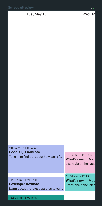
We now have dates along the top of our schedule! However, they don’t scroll when we scroll between days. Let’s keep track of the scroll states in our wrapper composable and then add horizontal scrolling to our header using the same scroll state.
@Composable
fun Schedule(...) {
    val dayWidth = 256.dp
    val hourHeight = 64.dp
    val verticalScrollState = rememberScrollState()
    val horizontalScrollState = rememberScrollState()
    Column(modifier = modifier) {
        ScheduleHeader(
            minDate = minDate,
            maxDate = maxDate,
            dayWidth = dayWidth,
            dayHeader = dayHeader,
            modifier = Modifier
                .horizontalScroll(horizontalScrollState)
        )
        BasicSchedule(
            events = events,
            eventContent = eventContent,
            minDate = minDate,
            maxDate = maxDate,
            dayWidth = dayWidth,
            hourHeight = hourHeight,
            modifier = Modifier
                .weight(1f)
                .verticalScroll(verticalScrollState)
                .horizontalScroll(horizontalScrollState)
        )
    }
}

@Composable
fun BasicSchedule(...) {
    ...
    Layout(
        content = { ... },
        modifier = modifier
            .verticalScroll(rememberScrollState())
            .horizontalScroll(rememberScrollState())
    ) { ... }
}
Our header now scrolls in sync with the schedule!
Hour Labels 
Similarly to the day headers, let’s label all the hours of the day on the left-hand side. We’ll start with a simple composable to show the hour:
private val HourFormatter = DateTimeFormatter.ofPattern("h a")
@Composable
fun BasicSidebarLabel(
time: LocalTime,
modifier: Modifier = Modifier,
) {
Text(
text = time.format(HourFormatter),
modifier = modifier
.fillMaxHeight()
.padding(4.dp)
)
}
@Preview(showBackground = true)
@Composable
fun BasicSidebarLabelPreview() {
WeekScheduleTheme {
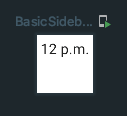
BasicSidebarLabel(time = LocalTime.NOON, Modifier.sizeIn(maxHeight = 64.dp))
}
}
Then, we’ll create a composable for the sidebar that uses a Column to show the labels for each hour down the side:
@Composable
fun ScheduleSidebar(
hourHeight: Dp,
modifier: Modifier = Modifier,
label: @Composable (time: LocalTime) -> Unit = { BasicSidebarLabel(time = it) },
) {
Column(modifier = modifier) {
val startTime = LocalTime.MIN
repeat(24) { i ->
Box(modifier = Modifier.height(hourHeight)) {
label(startTime.plusHours(i.toLong()))
}
}
}
}
@Preview(showBackground = true)
@Composable
fun ScheduleSidebarPreview() {
WeekScheduleTheme {
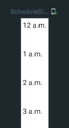
ScheduleSidebar(hourHeight = 64.dp)
}
}
Finally, we can show the sidebar to the left of the schedule by wrapping both of them in a Row. Just like before, we’ll add vertical scrolling to the sidebar using our existing verticalScrollState to move the sidebar times along with the events as the user scrolls.
@Composable
fun Schedule(...) {
    val dayWidth = 256.dp
    val hourHeight = 64.dp
    val verticalScrollState = rememberScrollState()
    val horizontalScrollState = rememberScrollState()
    Column(modifier = modifier) {
        ScheduleHeader(
            minDate = minDate,
            maxDate = maxDate,
            dayWidth = dayWidth,
            dayHeader = dayHeader,
            modifier = Modifier
                .horizontalScroll(horizontalScrollState)
        )
        BasicSchedule(
            events = events,
            eventContent = eventContent,
            minDate = minDate,
            maxDate = maxDate,
            dayWidth = dayWidth,
            modifier = Modifier
                .weight(1f)
                .verticalScroll(verticalScrollState)
                .horizontalScroll(horizontalScrollState)
        )
        Row(modifier = Modifier.weight(1f)) {
            ScheduleSidebar(
                hourHeight = hourHeight,
                modifier = Modifier
                    .verticalScroll(verticalScrollState)
            )
            BasicSchedule(
                events = events,
                eventContent = eventContent,
                minDate = minDate,
                maxDate = maxDate,
                dayWidth = dayWidth,
                hourHeight = hourHeight,
                modifier = Modifier
                    .weight(1f)
                    .verticalScroll(verticalScrollState)
                    .horizontalScroll(horizontalScrollState)
            )
        }
    }
}
Now we have both the header and sidebar scrolling with the schedule content.
However, you’ll notice that the header days no longer match up exactly to the days within the schedule and the events can’t be scrolled all the way over. This is because the schedule is shifted over to the right by the sidebar but the header is the full width, so we similarly have to offset the header. The simplest way I found to do this was to observe the size of the sidebar and add padding to the header:
@Composable
fun Schedule(...) {
    val dayWidth = 256.dp
    val hourHeight = 64.dp
    val verticalScrollState = rememberScrollState()
    val horizontalScrollState = rememberScrollState()
    var sidebarWidth by remember { mutableStateOf(0) }
    Column(modifier = modifier) {
        ScheduleHeader(
            minDate = minDate,
            maxDate = maxDate,
            dayWidth = dayWidth,
            dayHeader = dayHeader,
            modifier = Modifier
                .padding(start = with(LocalDensity.current) { sidebarWidth.toDp() })
                .horizontalScroll(horizontalScrollState)
        )
        Row(modifier = Modifier.weight(1f)) {
            ScheduleSidebar(
                hourHeight = hourHeight,
                modifier = Modifier
                    .verticalScroll(verticalScrollState)
                    .onGloballyPositioned { sidebarWidth = it.size.width }
            )
            BasicSchedule(...)
        }
    }
}
There we go! Now the dates at the top are centered once again.
Background Lines 
Next, let’s add some background divider lines between the hours and days. We can use the drawBehind modifier on our schedule layout to quickly draw simple shapes in the background. We’ll loop through every hour and day and draw a horizontal or vertical line that spans the entire width or height respectively for each one:
@Composable
fun BasicSchedule(...) {
    val numDays = ChronoUnit.DAYS.between(minDate, maxDate).toInt() + 1
    val dividerColor = if (MaterialTheme.colors.isLight) Color.LightGray else Color.DarkGray
    Layout(
        content = { ... },
        modifier = modifier
            .drawBehind {
                repeat(23) {
                    drawLine(
                        dividerColor,
                        start = Offset(0f, (it + 1) * hourHeight.toPx()),
                        end = Offset(size.width, (it + 1) * hourHeight.toPx()),
                        strokeWidth = 1.dp.toPx()
                    )
                }
                repeat(numDays - 1) {
                    drawLine(
                        dividerColor,
                        start = Offset((it + 1) * dayWidth.toPx(), 0f),
                        end = Offset((it + 1) * dayWidth.toPx(), size.height),
                        strokeWidth = 1.dp.toPx()
                    )
                }
            }
    ) { ... }
}
For the divider color I chose a simple light or dark gray depending on the theme, but you could also make it a parameter.
There we go! We now have nice dividing lines in the background.
Conclusion 
Our schedule composable is now much nicer looking than the first version, and thanks to Compose it was pretty straight forward to add these new features. You can view the code up to this point here.
This is where we’ll stop for now, but there are still lots of features we could add. For example:
Zooming
Snapping to closest day and/or hour on scroll
All-day events in the header
Events that span multiple days
Lazy rendering
Infinite scrolling
I’m planning on making this a library and continuing to work on these features. Check it out here.