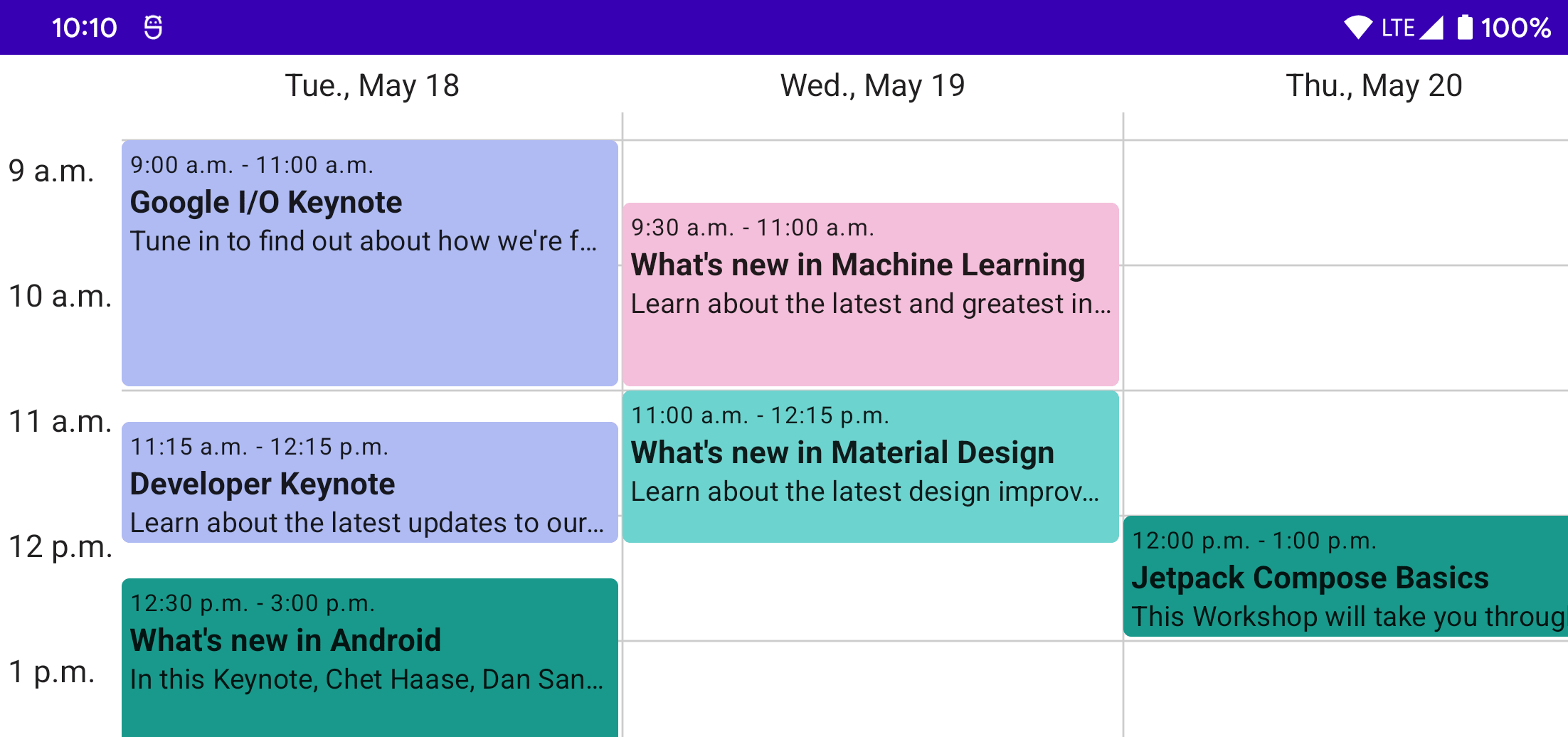
In this tutorial, we will be building a custom weekly schedule layout in Jetpack Compose. It will look similar to the week view in Google Calendar or other calendar apps.
Here is the final result:
Event Composable 
Let’s start with the most basic element that we want to show in our custom layout, the event. As a default we’ll show the event name, color, start/end date, and an optional brief description.
We’ll use a data class to store the information for each event:
data class Event(
    val name: String,
    val color: Color,
    val start: LocalDateTime,
    val end: LocalDateTime,
    val description: String? = null,
)
In order to use the Java time APIs with older versions of Android, you will need to configure core library desugaring in your gradle build file:
android {
    ...
    compileOptions {
        coreLibraryDesugaringEnabled true
        sourceCompatibility JavaVersion.VERSION_1_8
        targetCompatibility JavaVersion.VERSION_1_8
    }
}

dependencies {
    ...
    coreLibraryDesugaring 'com.android.tools:desugar_jdk_libs:1.0.9'
}
Now, we’ll create a basic event composable to show this data. We’ll start with a Column so we can stack elements vertically. The Column will use the event color in a background modifier with a RoundedCornerShape. It will also use padding modifiers to add space both inside the rounded shape and outside so back-to-back events aren’t touching.
@Composable
fun BasicEvent(
    event: Event,
    modifier: Modifier = Modifier,
) {
    Column(
        modifier = modifier
            .fillMaxSize()
            .padding(end = 2.dp, bottom = 2.dp)
            .background(event.color, shape = RoundedCornerShape(4.dp))
            .padding(4.dp)
    ) {

    }
}
Next, we’ll add some Text in the Column to show some of the event data:
val EventTimeFormatter = DateTimeFormatter.ofPattern("h:mm a")

@Composable
fun BasicEvent(
    event: Event,
    modifier: Modifier = Modifier,
) {
    Column(
        modifier = modifier
            .fillMaxSize()
            .padding(end = 2.dp, bottom = 2.dp)
            .background(event.color, shape = RoundedCornerShape(4.dp))
            .padding(4.dp)
    ) {
        Text(
            text = "${event.start.format(EventTimeFormatter)} - ${event.end.format(EventTimeFormatter)}",
            style = MaterialTheme.typography.caption,
        )

        Text(
            text = event.name,
            style = MaterialTheme.typography.body1,
            fontWeight = FontWeight.Bold,
        )

        if (event.description != null) {
            Text(
                text = event.description,
                style = MaterialTheme.typography.body2,
                maxLines = 1,
                overflow = TextOverflow.Ellipsis,
            )
        }
    }
}
Let’s set up a few sample events and use previews to see how it will look:
private val sampleEvents = listOf(
    Event(
        name = "Google I/O Keynote",
        color = Color(0xFFAFBBF2),
        start = LocalDateTime.parse("2021-05-18T13:00:00"),
        end = LocalDateTime.parse("2021-05-18T15:00:00"),
        description = "Tune in to find out about how we're furthering our mission to organize the world’s information and make it universally accessible and useful.",
    ),
    Event(
        name = "Developer Keynote",
        color = Color(0xFFAFBBF2),
        start = LocalDateTime.parse("2021-05-18T15:15:00"),
        end = LocalDateTime.parse("2021-05-18T16:00:00"),
        description = "Learn about the latest updates to our developer products and platforms from Google Developers.",
    ),
    Event(
        name = "What's new in Android",
        color = Color(0xFF1B998B),
        start = LocalDateTime.parse("2021-05-18T16:50:00"),
        end = LocalDateTime.parse("2021-05-18T17:00:00"),
        description = "In this Keynote, Chet Haase, Dan Sandler, and Romain Guy discuss the latest Android features and enhancements for developers.",
    ),
)

class EventsProvider : PreviewParameterProvider<Event> {
    override val values = sampleEvents.asSequence()
}

@Preview(showBackground = true)
@Composable
fun EventPreview(
    @PreviewParameter(EventsProvider::class) event: Event,
) {
    WeekScheduleTheme {
        BasicEvent(event, modifier = Modifier.sizeIn(maxHeight = 64.dp))
    }
}
Preview Annotations
We’re using @PreviewParameter and a PreviewParameterProvider to automatically show multiple previews for each of our sample events instead of writing multiple preview functions manually.
Now we can see our events!

Simple Column Layout 
Now that we have a basic event composable, let’s start on the custom layout to arrange the events according to their time.
We’ll need a new composable for our layout that takes a list of events to show and a composable lamba determining what to show for each event. By default, this will be our BasicEvent composable, but making this configurable makes it possible to change how events are displayed and add modifiers such as a click listener.
@Composable
fun Schedule(
    events: List<Event>,
    modifier: Modifier = Modifier,
    eventContent: @Composable (event: Event) -> Unit = { BasicEvent(event = it) },
) {

}
Anatomy of a Custom Layout 
To build a custom layout, we use the Layout composable. It takes a content lambda containing the children to arrange, a measurePolicy lambda to handle measuring and positioning the content, and an optional modifier. For more reference, there is a good overview of custom layouts on the layout documenation as well as a codelab walking you through creating another custom layout.
Layout(
    content = { /* composables to position */ },
    modifier = Modifier,
) { measureables, constraints ->
    val placeables = measureables.map { measurable ->
        measurable.measure(customConstraints)
    }

    layout(computedWidth, computedHeight) {
        placeables.forEach { placeable ->
            placeable.place(x, y)
        }
    }
}
The measurePolicy lambda is given a list of measurables and the incoming constraints of the layout. Within this lambda, we can measure each of the measurables, passing in any custom constraints as required by our layout. Once they are measured, we can compute the total size used by our layout and place the measured composables at the desired position within our layout.
Single Layout Pass
To keep layouts performant, Compose will only allow each measurable child to be measured once.
Building a Simple Column Layout 
Let’s start with building a layout for just a single day’s worth of events, and then we move on to multiple days. Since we want events to appear chronologically from top to bottom, we’ll start with arranging our events in a simple column layout much like the built in Column composable would.
First, lets add a Layout to our Schedule composable and give the layout our events as content:
@Composable
fun Schedule(
    events: List<Event>,
    modifier: Modifier = Modifier,
    eventContent: @Composable (event: Event) -> Unit = { BasicEvent(event = it) },
) {
    Layout(
        content = {
              events.sortedBy(Event::start).forEach { event ->
                  eventContent(event)
              }
        },
        modifier = modifier,
    ) { measureables, constraints ->
        /* TODO */
    }
}
Next, let’s measure each of the events and keep track of the total height used:
Layout(...) { measurables, constraints ->
    var height = 0
    val placeables = measureables.map { measurable ->
        val placeable = measurable.measure(constraints.copy(maxHeight = 64.dp.roundToPx()))
        height += placeable.height
        placeable
    }
}
Finally, we can loop through each of the placeables and position them within our layout. We have to keep track of the y position as we go so they don’t overlap.
Layout(...) { measurables, constraints ->
var height = 0
val placeables = ...
layout(constraints.maxWidth, height) {
var y = 0
placeables.forEach { placeable ->
placeable.place(0, y)
y += placeable.height
}
}
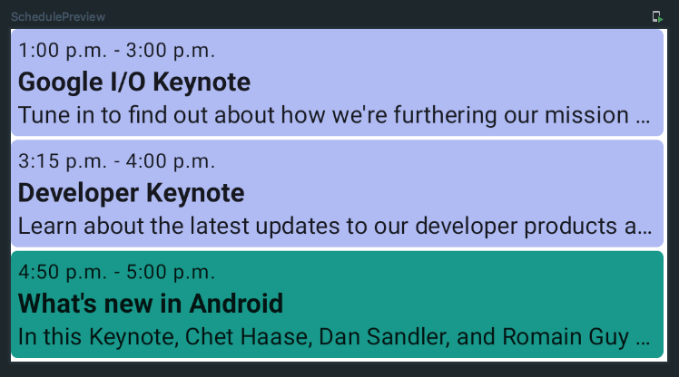
}And that’s it! Now we can set up a preview to see how it looks:
@Preview(showBackground = true)
@Composable
fun SchedulePreview() {
    WeekScheduleTheme {
        Schedule(sampleEvents)
    }
}
It works! We have a simple list of all of our events.
Schedule Layout 
Attaching Data to Composables 
A list of events is great, but we could already accomplish that with the built in Column composable. Let’s modify our layout to use the event time to control the y position of the events.
There’s just one problem – within the Layout composable we only have measurables to work with. But those don’t have any information about the underlying event they represent, so how are we supposed to position them correctly?
This is where a ParentDataModifier comes in. It allows us to attach data to a composable with a modifier, and then read that data from a measurable within a layout.
Let’s create our own:
private class EventDataModifier(
    val event: Event,
) : ParentDataModifier {
    override fun Density.modifyParentData(parentData: Any?) = event
}
This modifier will attach our Event data class as parentData to the composable. We can also add an extension function to Modifier to easily add this custom modifier:
private fun Modifier.eventData(event: Event) = this.then(EventDataModifier(event))Now, let’s update the content lambda of our Layout composable to attach the event data:
Layout(
    content = {
          events.sortedBy(Event::start).forEach { event ->
              eventContent(event)
              Box(modifier = Modifier.eventData(event)) {
                  eventContent(event)
              }
          }
    },
    modifier = Modifier,
) { measurables, constraints ->
    ...
}
What’s with the Box wrapper?
We have to wrap the eventContent in a plain Box to be able to add a modifier to it, since we don’t know exactly what will be in eventContent. There might be other ways to add a modifier to an unknown composable child, but I haven’t discovered how yet.
We could have also exposed the eventData modifier and allowed callers to pass in their own content using that modifier to the Layout directly, but doing it within our own composable opens up the possibility of doing lazy composition depending what days/hours are visible on the screen. Maybe that will be in a future tutorial!
Now that the content for our layout has the event attached, we can access it from the measurable like so:
val placeables = measurables.map { measurable ->
    val event = measurable.parentData as Event
    ...
}
Positioning Events 
We’ll need to decide how tall we want an hour of time to be in our layout. For simplicity we’ll just pick an arbitrary value for now, but this could be a parameter to the composable or could be controlled by the user zooming in/out.
Using this hour height, we can then constrain the events based on their duration and position them within the layout according to their start time.
Since we’re showing a full day of events, we also now know the full height of the layout regardless of the content. Let’s update our layout with those changes:
val hourHeight = 64.dp
Layout(...) { measureables, constraints ->
    var height = 0
    val placeables = measureables.map { measurable ->
        val placeable = measurable.measure(constraints)
        height += placeable.height
        placeable
    }
    val height = hourHeight.roundToPx() * 24
    val placeablesWithEvents = measureables.map { measurable ->
        val event = measurable.parentData as Event
        val eventDurationMinutes = ChronoUnit.MINUTES.between(event.start, event.end)
        val eventHeight = ((eventDurationMinutes / 60f) * hourHeight.toPx()).roundToInt()
        val placeable = measurable.measure(constraints.copy(minHeight = eventHeight, maxHeight = eventHeight))
        Pair(placeable, event)
    }
    layout(constraints.maxWidth, height) {
        var y = 0
        placeables.forEach { placeable ->
            placeable.place(0, y)
            y += placeable.height
        }
        placeablesWithEvents.forEach { (placeable, event) ->
            val eventOffsetMinutes = ChronoUnit.MINUTES.between(LocalTime.MIN, event.start.toLocalTime())
            val eventY = ((eventOffsetMinutes / 60f) * hourHeight.toPx()).roundToInt()
            placeable.place(0, eventY)
        }
    }
}
Our events now show up in our layout based on their times!
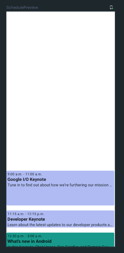
But, since an entire day could be quite long, a lot of the events might show up off the screen. We can easily address this by making our layout scrollable. With Compose, that’s as simple as adding a single modifier to the layout:
Layout(
    content = { ... },
    modifier = modifier
        .verticalScroll(rememberScrollState())
)
Now we can scroll up and down an entire day’s worth of events.
Showing Events Across Multiple Days 
Now that we have our events showing for a single day, lets extend our layout to support showing events across multiple days.
To start, we need to know the minimum and maximum dates that we want to show. Let’s add those as parameters to our Schedule composable, with the default being the minimum and maximum dates of the events passed in.
@Composable
fun Schedule(
    events: List<Event>,
    modifier: Modifier = Modifier,
    eventContent: @Composable (event: Event) -> Unit = { BasicEvent(event = it) },
    minDate: LocalDate = events.minByOrNull(Event::start)!!.start.toLocalDate(),
    maxDate: LocalDate = events.maxByOrNull(Event::end)!!.end.toLocalDate(),
) {
    ...
}
We’ll also need to decide how wide a day should be. Similarly to the hour height, we’ll choose an arbitrary value for simplicity but this could be another parameter or could be computed based on the device width.
Then, we can use the day width to further constrain the events to fit within a day and to compute the x position within our layout.
Let’s make those changes:
@Composable
fun Schedule(...) {
    val hourHeight = 64.dp
    val dayWidth = 256.dp
    val numDays = ChronoUnit.DAYS.between(minDate, maxDate).toInt() + 1
    Layout(...) { measureables, constraints ->
        val height = hourHeight.roundToPx() * 24
        val width = dayWidth.roundToPx() * numDays
        val placeablesWithEvents = measureables.map { measurable ->
            val event = measurable.parentData as Event
            val eventDurationMinutes = ChronoUnit.MINUTES.between(event.start, event.end)
            val eventHeight = ((eventDurationMinutes / 60f) * hourHeight.toPx()).roundToInt()
            val placeable = measurable.measure(constraints.copy(minHeight = eventHeight, maxHeight = eventHeight))
            val placeable = measurable.measure(constraints.copy(minWidth = dayWidth.roundToPx(), maxWidth = dayWidth.roundToPx(), minHeight = eventHeight, maxHeight = eventHeight))
            Pair(placeable, event)
        }
        layout(constraints.maxWidth, height) {
        layout(width, height) {
            placeablesWithEvents.forEach { (placeable, event) ->
                val eventOffsetMinutes = ChronoUnit.MINUTES.between(LocalTime.MIN, event.start.toLocalTime())
                val eventY = ((eventOffsetMinutes / 60f) * hourHeight.toPx()).roundToInt()
                placeable.place(0, eventY)
                val eventOffsetDays = ChronoUnit.DAYS.between(minDate, event.start.toLocalDate()).toInt()
                val eventX = eventOffsetDays * dayWidth.roundToPx()
                placeable.place(eventX, eventY)
            }
        }
    }
}
Again, since all the days might not fit on the device, we can add another modifier to support scrolling horizontally as well:
Layout(
    content = { ... },
    modifier = modifier
        .verticalScroll(rememberScrollState())
        .horizontalScroll(rememberScrollState())
) { measureables, constraints ->
    ...
}
Finally, lets add a few more events on different days to our sample data:
private val sampleEvents = listOf(
    ...
    Event(
        name = "What's new in Machine Learning",
        color = Color(0xFFF4BFDB),
        start = LocalDateTime.parse("2021-05-19T09:30:00"),
        end = LocalDateTime.parse("2021-05-19T11:00:00"),
        description = "Learn about the latest and greatest in ML from Google. We’ll cover what’s available to developers when it comes to creating, understanding, and deploying models for a variety of different applications.",
    ),
    Event(
        name = "What's new in Material Design",
        color = Color(0xFF6DD3CE),
        start = LocalDateTime.parse("2021-05-19T11:00:00"),
        end = LocalDateTime.parse("2021-05-19T12:15:00"),
        description = "Learn about the latest design improvements to help you build personal dynamic experiences with Material Design.",
    ),
    Event(
        name = "Jetpack Compose Basics",
        color = Color(0xFF1B998B),
        start = LocalDateTime.parse("2021-05-20T12:00:00"),
        end = LocalDateTime.parse("2021-05-20T13:00:00"),
        description = "This Workshop will take you through the basics of building your first app with Jetpack Compose, Android's new modern UI toolkit that simplifies and accelerates UI development on Android.",
    ),
)
Now if we run the app we can see there are 3 days of events, and we can scroll both vertically and horizontally to view them all!
Conclusion 
That’s it for part 1 of this series! It really is much easier than I expected to build totally custom layouts with Jetpack Compose. You can view the code up to this point here.
In part 2, we’ll add day headers, times along the side, and background lines to split up the days and hours.